Tactile Visualization
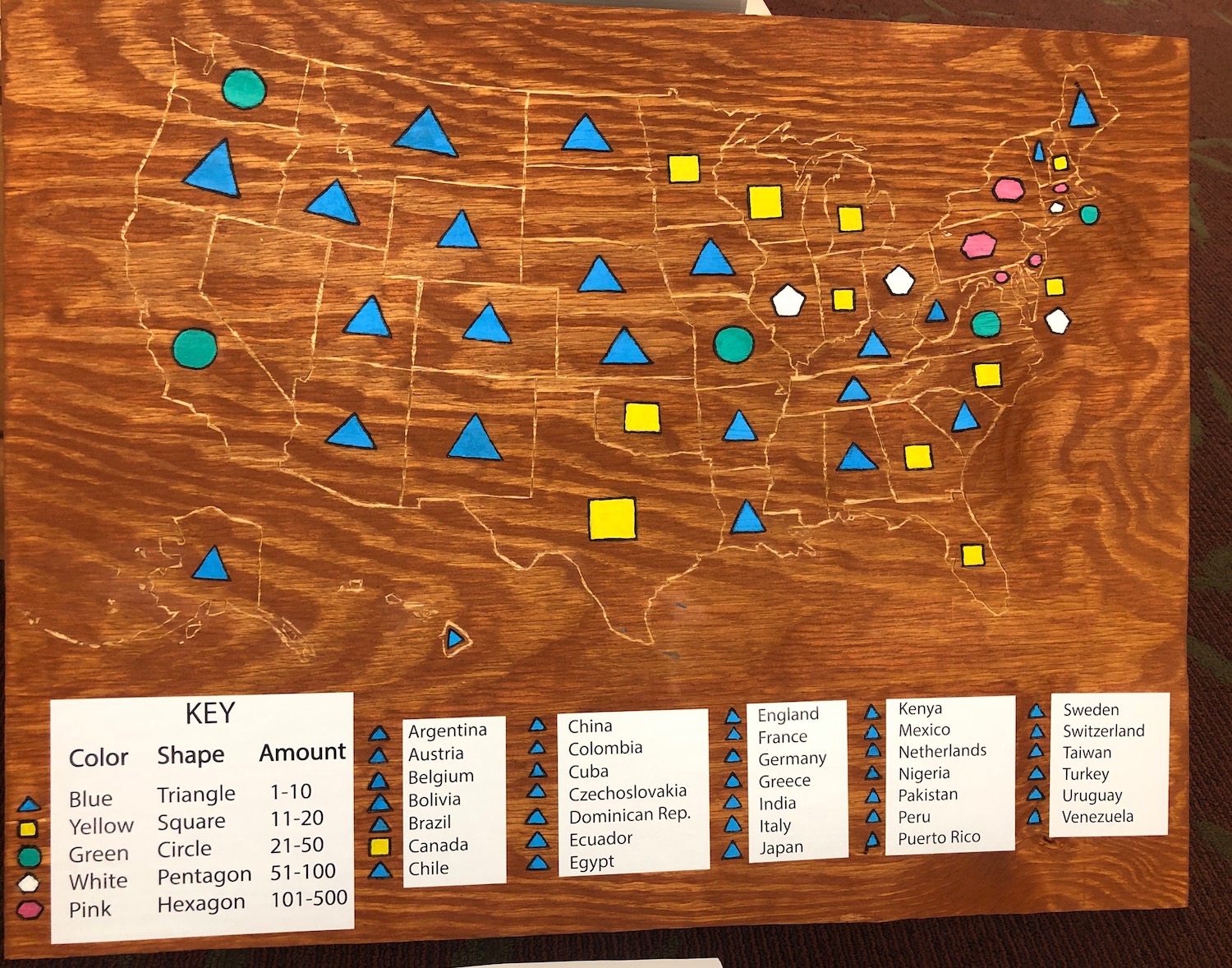
Creating a physical representation of data allowed our team to step away from our laptops and engage in hands-on critical making. For the project, we carved a map of the United States onto a piece of plywood and etched one of five shapes in the middle of each state, representing different concentrations of graduated students from each location in a handful of years between 1931 and 1949. Not every commencement issue listed the home states of graduating students, so some graduating classes are not represented in the visualization.
We prepared for the project by searching corpus text files for commencement issues that included graduating students’ names and where they are from. We were then able create new text files for each of the 26 issues so the files only had these two section(s). After cleaning the data in OpenRefine, we were able to find students from 47 states plus Washington D.C. and 34 other countries and territories.
Once we gathered the data, the team was able to break ground. We sanded and stained the plywood, printed out chunks of the U.S. map to trace using carbon paper, used a wood carving tool to etch an outline of the states, wood burned shapes in the center of each state and for each international location, and colored the shapes with acrylic paint for easier identification.
Our key includes five shapes with their own distinct color that indicate the number of students from that particular state. For example, triangles are blue and represent 1-10 graduates, squares are yellow and represent 11-20 graduates, circles are green and represent 21-50 graduates, and hexagons are pink and represent 101-500 graduates.